
Theodore Lowe, Ap #867-859
Sit Rd, Azusa New York
Find us here
The Art of Photo Harmonization: A Complete Guide

Photo harmonization is an essential skill for photographers and graphic designers. It ensures that images blend seamlessly, creating a cohesive and aesthetically pleasing visual. Understanding the principles of color, light, and composition is crucial. Tools like Photoshop offer features that aid in achieving perfect harmonization.
This guide delves into practical techniques, from basic adjustments to advanced layering and masking. By mastering these skills, anyone can transform their photos into stunning works of art. Whether you are a beginner or a seasoned professional, this guide provides valuable insights to enhance your photo editing skills.
Essential Tools And Software
Photo harmonization is an art that combines different photos into one. You need the right tools and software to do this well. This guide covers the best software and basic tools.
Top Software Choices
Professional photo editors rely on top software. These programs offer advanced features. Here are some top picks:
-
Adobe Photoshop: Known for its robust features.
-
GIMP: A free alternative with many tools.
-
Corel PaintShop Pro: Great for detailed editing.
-
Affinity Photo: Offers powerful options at a lower price.
Basic Tools For Beginners
Beginners need simple tools to start. These tools help you learn the basics:
-
Crop Tool: Focus on the important parts of your photo.
-
Brush Tool: Make small edits and touch-ups.
-
Layers: Combine different elements smoothly.
-
Color Balance: Adjust colors for a natural look.
-
Clone Stamp: Remove unwanted parts of the photo.
These tools are easy to use. They help you create beautiful photos.
Color Theory Basics
In the world of photography, understanding color theory is vital. It helps you create visually appealing and harmonious images. This guide dives into the basics of color theory, starting with the color wheel and the role of primary and secondary colors.
Understanding Color Wheels
The color wheel is a circle of colors arranged by their chromatic relationship. It helps photographers see how colors interact and complement each other. The wheel consists of 12 main colors, divided into three categories: primary, secondary, and tertiary.
Primary colors are red, blue, and yellow. These colors cannot be created by mixing other colors. Secondary colors are green, orange, and purple. They are made by mixing two primary colors.
|
Color Category |
Colors |
|---|---|
|
Primary Colors |
Red, Blue, Yellow |
|
Secondary Colors |
Green, Orange, Purple |
Primary And Secondary Colors
Primary colors are the foundation of all other colors. They are pure and cannot be made by mixing other colors. These colors include red, blue, and yellow. They form the basis for creating secondary and tertiary colors.
Secondary colors are created by mixing two primary colors. For example:
-
Green is made by mixing blue and yellow.
-
Orange is made by mixing red and yellow.
-
Purple is made by mixing red and blue.
Understanding these basics helps photographers to create balanced and harmonious photos. Using the color wheel, photographers can easily identify complementary, analogous, and triadic color schemes.
Techniques For Color Matching
The art of photo harmonization requires mastery of color matching techniques. Colors play a vital role in setting the mood and tone of an image. By using effective methods, you can create visually appealing and cohesive photos. This section explores essential techniques for color matching.
Using Color Palettes
Color palettes are a great way to ensure your photos have harmonious colors. A color palette is a selection of colors that work well together.
-
Complementary Colors: Colors opposite each other on the color wheel.
-
Analogous Colors: Colors next to each other on the color wheel.
-
Triadic Colors: Three colors evenly spaced around the color wheel.
Tools like Adobe Color or Coolors can help generate palettes. These tools offer predefined palettes or allow you to create custom ones.
Incorporate your chosen palette throughout your photo editing process. This will ensure consistency and visual appeal in your images.
Color Grading Tips
Color grading involves adjusting the colors of your photo to achieve a specific look. Here are some tips:
|
Tip |
Description |
|---|---|
|
Use Presets |
Presets can simplify the color grading process. |
|
Adjust White Balance |
White balance affects the overall warmth or coolness. |
|
Experiment with Curves |
Curves can fine-tune the tonal range of your image. |
|
Saturation and Vibrance |
Adjust these to enhance or mute colors. |
Experimenting with these elements can help you find the perfect balance. Aim for a cohesive look that enhances your subject and overall composition.
Balancing Light And Shadows
Balancing Light and Shadows is a critical skill in photo harmonization. It brings life to your images and adds depth and dimension. Properly balancing these elements ensures your photos have a professional touch.
Adjusting Brightness And Contrast
Adjusting brightness and contrast can transform your photos. Brightness changes the light in the whole image. Contrast affects the difference between light and dark areas.
-
Brightness: Increase brightness for a lighter image. Reduce it for a darker image.
-
Contrast: Higher contrast makes shadows darker and highlights brighter. Lower contrast softens the difference.
Use photo editing software to adjust these settings. Many tools are available to help you achieve the perfect balance.
Shadow Techniques
Shadows add depth and realism to photos. Here are some techniques to enhance shadows:
-
Directional Lighting: Use light from one direction to cast natural shadows.
-
Shadow Intensity: Adjust the darkness of shadows for a dramatic effect.
-
Soft Shadows: Create soft shadows for a gentle, diffused look.
Directional lighting can be achieved by using a single light source. Experiment with different light positions. This can create interesting shadow patterns and depth.
Shadow intensity can be adjusted in most editing software. Increase shadow intensity for a bold look. Decrease it for a more subtle appearance.
Soft shadows are often preferred for portraits. Use diffusers or softboxes to soften the light. This technique can reduce harsh lines and create a pleasing effect.
Composition Rules
Understanding composition rules is essential for achieving stunning photo harmonization. These rules guide the placement of elements in your frame. They help to create balance and interest. Let's delve into some key composition rules. We'll explore the Rule of Thirds and Leading Lines.
Rule Of Thirds
The Rule of Thirds is one of the most fundamental composition rules. Imagine your photo divided into nine equal parts. This is done by two equally spaced horizontal lines and two vertical lines. The main subject should be placed along these lines or their intersections.
-
This creates more tension, energy, and interest.
-
It avoids placing the subject in the center.
-
Your photo will look more balanced.
Use the Rule of Thirds to guide the viewer’s eye. This makes your photo more engaging and professional.
Leading Lines
Leading Lines are another powerful tool in photo composition. These are lines within an image that lead the viewer's eye to the main subject.
|
Type of Leading Lines |
Effect |
|---|---|
|
Horizontal lines |
Create a sense of calm and stability. |
|
Vertical lines |
Imply growth and strength. |
|
Diagonal lines |
Add a dynamic and exciting feel. |
Leading Lines can be roads, rivers, fences, or even shadows. They help in guiding the viewer's attention to the important parts of the photo. This makes your images more compelling and well-composed.
Advanced Editing Techniques
Mastering advanced editing techniques elevates your photo harmonization skills. These techniques bring depth and creativity to your work. Let's explore layering and masking and blending modes.
Layering And Masking
Layering and masking are essential for advanced photo editing. They allow you to work on different parts of an image separately.
-
Layering: Layers stack on top of each other. Each layer can hold different elements.
-
Masking: Masks hide or reveal parts of a layer. This gives you control over what is visible.
To create a mask:
-
Select the layer you want to mask.
-
Click the mask icon in your editing software.
-
Use a brush tool to paint on the mask. Black hides, white reveals.
Combining layering and masking helps create complex and stunning images.
Blending Modes
Blending modes change how layers interact with each other. They affect the way colors and tones blend.
|
Blending Mode |
Description |
|---|---|
|
Multiply |
Makes the image darker by multiplying base color with blend color. |
|
Screen |
Lightens the image by inverting the base color and multiplying by blend color. |
|
Overlay |
Combines Multiply and Screen for a contrast effect. |
To use blending modes:
-
Select the layer you want to blend.
-
Choose a blending mode from the dropdown menu.
-
Adjust the opacity if needed.
Experiment with different modes for unique results. Blending modes can transform your photos.
Practical Applications
The art of photo harmonization can transform any image. This technique has many practical uses. From portraits to landscapes, harmonization makes photos pop. Let's explore some key applications.
Harmonizing Portraits
Portraits capture a person's essence. Harmonizing these photos enhances their beauty. Use color balance to match skin tones. This makes the subject look natural and radiant.
Lighting is crucial in portraits. Adjust the light to highlight the subject’s features. Soft lighting works well for a gentle look. Harsh lighting can add drama.
Backgrounds also play a big role. Choose a background that complements the subject. A clutter-free background keeps focus on the person.
Enhancing Landscapes
Landscapes showcase nature's beauty. Harmonization brings out vibrant colors. Adjust the saturation to make greens greener and blues bluer.
Contrast is key in landscape photos. Enhance contrast to make elements stand out. This creates depth and dimension.
Use the rule of thirds for better composition. Place key elements off-center for a balanced look. This draws the viewer's eye across the scene.
|
Aspect |
Portraits |
Landscapes |
|---|---|---|
|
Color Balance |
Match skin tones |
Boost natural colors |
|
Lighting |
Highlight features |
Create depth |
|
Background |
Keep it simple |
Use rule of thirds |
With these tips, your photos will shine. Practice harmonization to see amazing results.
Common Mistakes To Avoid
In the journey of mastering photo harmonization, many make common mistakes. Avoiding these pitfalls can elevate your photography skills significantly. Below, we highlight some of the key mistakes to steer clear of.
Over-saturation
Over-saturation can ruin your photo's natural look. Adding too much color can make images look fake. Always aim for a balance in color intensity.
|
Issue |
Effect |
|---|---|
|
Too much color |
Unnatural and overwhelming |
|
Loss of detail |
Important elements may get hidden |
Use your photo editing software's saturation tool wisely. Adjust the sliders until the colors look balanced and realistic. Check your work on different screens for consistency.
Ignoring Backgrounds
Ignoring backgrounds can make your photo look cluttered. A distracting background can take away from your main subject. Always pay attention to what’s behind your subject.
-
Check for distractions: Remove or minimize them.
-
Use a shallow depth of field: This blurs the background.
-
Choose a simple background: It highlights your subject better.
Remember, the background is as important as the subject. It can either enhance or detract from your photo’s impact. Pay attention to every detail in the frame.
Conclusion
Learn photo harmonization to improve your photography. It helps you create beautiful, balanced pictures. Practice and try new things. You'll become more creative and your photos will look amazing.
Related blog posts
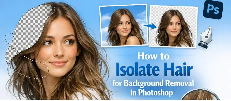
How to Isolate Hair for Background Removal in Photoshop
Are you tired of spending hours trying to perfectly isolate hair from a background in Photoshop, only to end up with messy, unnatural edges? You're not alone.
Clipping Path Associate has empowered businesses globally for over 12 years. A passionate team is dedicated to providing meticulous photo editing services. Expertise is offered in a range of areas, from precise clipping paths to flawless image retouching. The company offers straightforward yet impactful solutions tailored for photographers, e-commerce enterprises, advertising agencies, web design firms, magazine publishers, printing companies, and more.
We Accept :